Привет✌ Я создаю дизайн для клиентских сервисов и приложений
Успела поработать в корпорациях и стартапах, получила тонну полезных инсайтов
Могу найти компромисс между скоростью и качеством при 🔥, но сама всегда за качество
Регулярно провожу ревью для junior и middle коллег-дизайнеров
Как я работаю...


Мои проекты
Meetings Platform
Designed the Meetings video call service as part of the client service platform for real estate company
Wildberries

Лидер российского e-commerce. Платформа известна своим широким ассортиментом товаров в различных категориях, таких как мода, электроника, косметика и товары для дома.
Компания
Отвечала за опыт совершения покупки в мобильном приложении. Основным фокусом для нас с командой была конверсия в оформление заказа и общий рост выручки. При этом, было важно обеспечить для пользователей максимально простой путь с прозрачными условиями на каждом этапе взаимодействия, чтобы повысить NPS и минимизировать юридические риски.
Моя роль
Информации, которую нужно показывать на сниппете становилось всё больше, а с растущим количеством новых фичей стало необходимым обновить текущий дизайн, чтобы снизить когнитивную нагрузку и повысить считываемость данных на экране.
Редизайн сниппетов
To reduce the number of users navigating from the bag to the product details page and improve conversion rate to the purchase, I developed a feature that allows users to change color and size directly on the product snippet in the bag.
Users can choose between two actions: replacing the item or adding a new variant. The current price of the selected color is also shown to help users make informed decisions.
Users can choose between two actions: replacing the item or adding a new variant. The current price of the selected color is also shown to help users make informed decisions.
Изменение размера и цвета товара в корзине
The old empty view in the Android and IOS applications was inconsistent and unhelpful. In the redesign, we added product recommendations and a friendly description of the current state.
According to our data, users often visit product page from search results. We integrated search field from the main page into the empty bag view to better align with user patterns.
According to our data, users often visit product page from search results. We integrated search field from the main page into the empty bag view to better align with user patterns.
Переход к поиску товара из пустого состояния
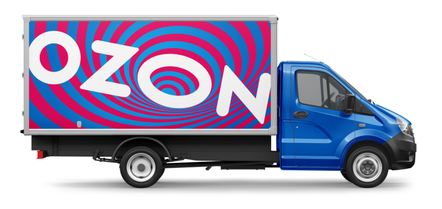
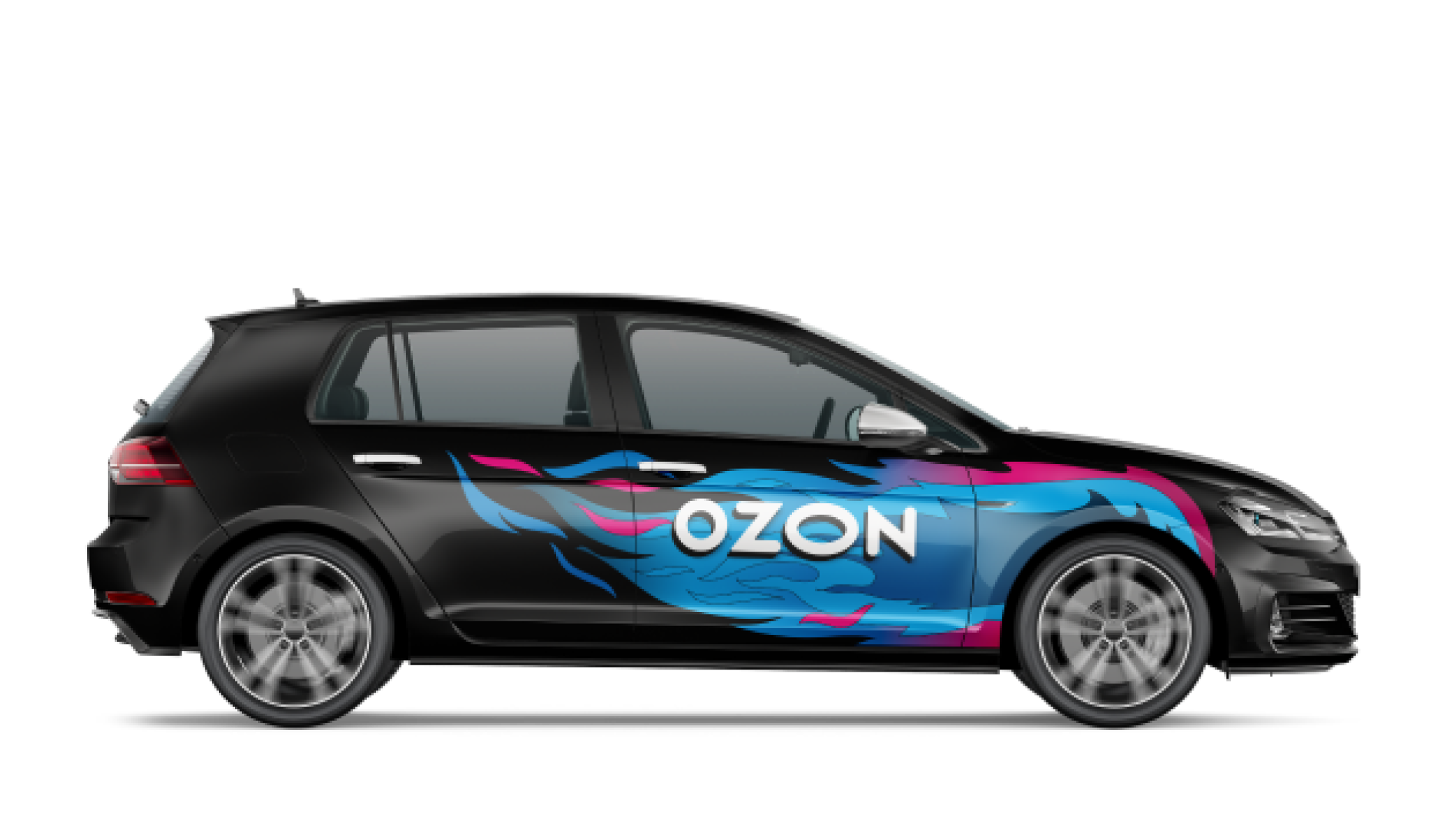
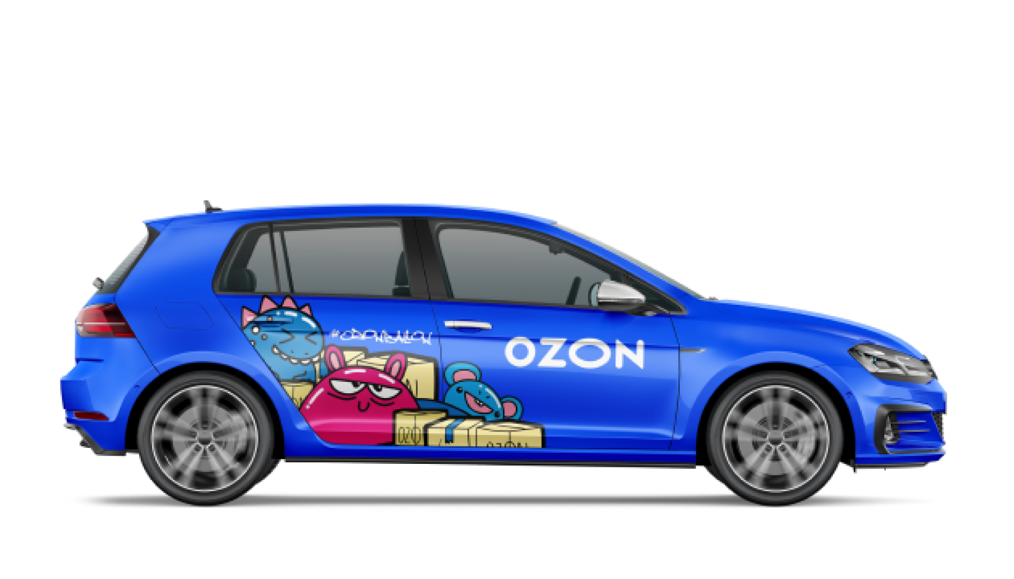
Ozon logistics
Ozon marketplace provides various services such as express delivery, pickup points, and a robust online marketplace for third-party sellers. The platform is known for its customer-centric approach, innovative logistics, and technology-driven solutions.
Company
For two years, I worked on logistics products at Ozon. During this time, I revamped the architecture of the existing Courier App, provided support for the mobile app used by mainline drivers, and developed new features for the Partners Platform — open map for potential franchisees.
My role

One of the most exciting projects I worked on at Courier App was main layouts redisign. Our goal was to enhance the number of tasks on couriers' route sheets by reducing the time it takes for courier to unload and deliver goods to customers.
Previously, couriers couldn’t view information about their route before they completed the vehicle selection and long lasting pickup process. It prevented them from planning their route in advance.
Increased the Speed of Route Planning
Embedded Shift Start Widgets into the Main Route Layout
To ensure a seamless workflow and allow couriers to view their upcoming route, I integrated vehicle selection and pickup widgets into the main interface, which previously could only be used after those processes were completed.
According to our NPSs, 60% of users preferred the map view and found it more convenient, but it was secondary in the old app design, which divided the interface into two tabs: route and map view. In the new design, we ensured that the map is always accessible.
Enhanced Map Accessibility
letz talk

A mobile application for finding friends and conversation partners that helps people connect with soulmates. The primary audience of the app is women because it focuses on communication free from flirting. The service prohibits sharing nudity and using hate speech, creating a comfortable atmosphere and fostering a unique community.
Company
I worked on the app from its inception — overseeing design and research, assembling a team of designers and personally crafting key design features.
My role
The app’s list of interests had remained limited since the MVP stage, and users often pointed this out.
To better capture the diverse interests of our community, we expanded the list to cover areas such as beliefs, lifestyle, culture, and personal growth. We also added a search pattern and organized interests into categories to make navigation easier.
To better capture the diverse interests of our community, we expanded the list to cover areas such as beliefs, lifestyle, culture, and personal growth. We also added a search pattern and organized interests into categories to make navigation easier.
Expanded List of Interests
Retention rate is one of key metrics of the app. We started exploring a simple idea: could more communication in the app significantly boost it?
So we made up the Meetings Wave feature. Previously, the app operated on a match-based system. We decided to break this logic. For 4 hours each day, the match requirement will be disabled, enabling users to jump directly into chats.
So we made up the Meetings Wave feature. Previously, the app operated on a match-based system. We decided to break this logic. For 4 hours each day, the match requirement will be disabled, enabling users to jump directly into chats.
Meetings Wave: Elevating User Activity
We took all risks: users might face spam, mismatched personalities, aggressive behavior, or simply too much communication. That’s why we’ve included an option to turn off this feature, allowing users to decide if they want to participate or not.
Despite the app being originally for non-romantic connections, many users, drawn by the great community, were also interested in finding a romantic partner for the long run.
To address this, I added a "Goals" feature. Users can now choose "Only Friendship" or "Open to Dating." This separation helps prevent conflicts. Since the release, we now receive 53% fewer complaints about "Inappropriate Flirting."
To address this, I added a "Goals" feature. Users can now choose "Only Friendship" or "Open to Dating." This separation helps prevent conflicts. Since the release, we now receive 53% fewer complaints about "Inappropriate Flirting."
Solved the Issue of Goal Mismatch